HubSpot, Revenue Operations

Building a Simple RevOps Dashboard in HubSpot

Published:

Share:

You have a CRM full of deals. You still can’t tell anyone where your pipeline actually stands.

That’s not a data problem. It’s a reporting problem. The numbers are sitting in HubSpot right now. Nobody built the place to see them.

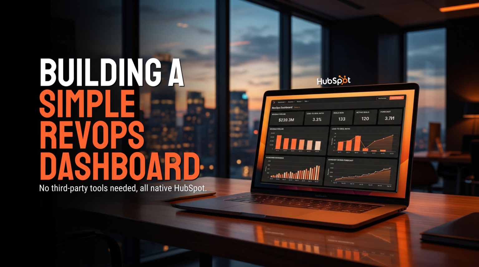
Here’s how we build a RevOps pipeline dashboard for a client account using five reports, all native to HubSpot, no third-party tools.

Start With One Dashboard, Not Five Reports Floating Around

Before you build a single report, create the home for it. In HubSpot, go to Reports, then Create Dashboard, then New Dashboard from Scratch. Name it something plain, like “RevOps Pipeline Dashboard.” Every report below gets saved and added straight to it.

One dashboard. Five reports. One place a founder or a sales lead opens on a Monday to see the whole picture, instead of five separate places nobody remembers to check.

Report One and Two: What's Open and What It's Worth

The first report is open deals by stage. Build a custom report, switch the data source from contacts to deals, and set it up as a vertical bar chart. Count of deals on the Y-axis, deal stage on the X-axis. Filter down to the open stages only. Everything except closed won and closed lost.

Say your open stages are appointment scheduled, qualified to buy, presentation scheduled, decision maker bought in, and contract sent. This report shows you exactly how many deals sit in each one, at a glance, instead of you scrolling a list view trying to count them.

Report two uses the same setup, but with a different question. Instead of counting deals, sum the deal amount, grouped the same way. Now you’re not just seeing how many deals sit in each stage. You’re seeing what they’re worth.

That’s where it gets interesting. It’s common to find that two or three deals in a late stage, like decision maker bought in, make up a third of your entire open pipeline value. Count alone would never show you that. Value by stage does.

Report Three and Four: What's Closing and What You're Actually Winning

Report three filters by close date, this month only, still excluding anything already closed. This is the report that tells you what’s actually on deck to land in the next few weeks, not the whole pipeline. A large deal sitting in contract sent with a close date this month is exactly the kind of thing this report is built to surface.

Report four is win rate. By filtering closed deals to compare what was won versus what was lost, this report gives you a clear, side-by-side view of your conversion health. Understanding this true win rate is critical, but that ratio is often invisible until someone builds the report that puts it right in front of you.

Save both, add both to the dashboard.

Report Five: The Blanks Nobody Notices

The last report catches something a stage-by-stage view never will: deals that are broken before anyone even works them. Filter for deal name has no value. Save it, add it to the dashboard.

It’s not unusual for this to pull up a handful of blank records sitting early in the pipeline, deals with no name attached, just sitting there. A report tells you the blanks exist. It doesn’t fix them. Someone still has to open each record and chase it down.

We’ve written before about The HubSpot Board View Feature Nobody Configures for the opposite kind of visibility problem, seeing where one record stands the moment you open HubSpot. Reports solve a different job. They add the numbers up across every deal so you can see totals, gaps, and rates that no single board view will ever show you.

A Dashboard Doesn't Fix Anything By Itself

Five reports in one place doesn’t replace someone checking the pipeline. It gives that person five places to check it instead of zero.

That distinction matters more than it sounds like it should. We’ve talked before about how Why Execution Capacity Is What’s Killing Your Pipeline usually isn’t a strategy problem, it’s whether anyone actually has the bandwidth to look at the data every week and act on what it shows. A dashboard makes that fifteen-minute look worth doing. It doesn’t do the looking for you.

If you’re already running a weekly pipeline review the way we described in How We Use Claude to Run RevOps, this dashboard is the numbers layer underneath it. The blanks, the stalled value, the win rate gap, all sitting in one place, ready before that review even starts.

If your HubSpot has this data sitting in it right now with nothing built to show it, that’s what we fix. 

Latest Posts